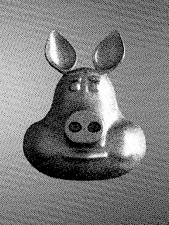
Some compositing experiments, mimicing black and white print

The other day I was reading about old printing techniques and I wanted to create the look and feel of screen printing with half tones and screen tones or even recreate a wood block printed look.

The approach I came up with and want to share here is pretty simple and versatile and completely implemented in compositor nodes and in the section below I show the necessary node setup. Although done in the compositor I dearly missed the possibility to create OSL nodes in the compositor because it would be nice to have some more textures to choose from.

Node setup

The general idea is to take a black and white version of your rendered image and combine it with some pattern. If that pattern is a smoothly varying grey scale image then it is possible compare that pattern against the b&w image and produce just black and white pixels but more of each will be produced at darker and lighter areas respectively. If that sounds confusing, bear with me it will get clearer in a minute.
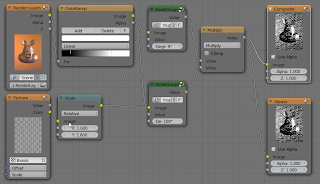
The image at the start of the article was created with the node setup shown above. The image was renderered in Cycles but composited in Blender internal to be able to use textures in the compositor. This a bit awkward but not all that difficult: just set up your scene in cycles and if it renders ok, switch to bkender internal, add a new material to an arbitrary object (but don't assign it to any actual geometry) and then add a wood texture. This wood texture will give us paralel lines we can use in the compositor even though it is not actually used in any material. If you enable compositing in the post processing panel and press F12 to render, the scene will render in Cycles even though the render engine us set to internal.

In the noodle above we convert the image to black and white by plugging it into a value socket. This happens to be a colorramp node which allows use to tweak the contrast etc. The texture node refers to the wood texture we created earlier. This texture is also scaled so it will give us the line spacing we want. The real work is done in the two group nodes. These take the image and our texture, rotate the texture and do the comparison. Multiplying two versions with the lines at 90 degrees to each other give us the point pattern in the opening image.

The node group not only rotates the texture but compares it to the image. We do not simply compare whether the black & white value of the image is larger tgan that of the texture because this would give rise to horrible aliasing effects. Therefore the light orange nodes implement a smoothstep() whose smoothness is controlled by the red value node (More on this here).

Variations

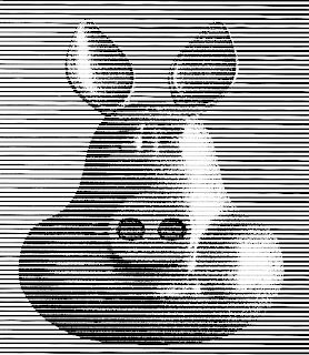
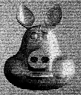
Of course, in stead of multiplying two perpendicular sets if regular lines you could use any suitable pattern. The first image uses a single pattern of horizontal lines and the second image uses a marble pattern to create a wood block like appearance.
Even though you cannot uze OSL in the compositor I think it would be possible to setup two scenes in cycles, one with your image and one with just an OSL. pattern on a plane and combine these in the ckmpositor.
If you would like to know more about programming OSL you might be interested in my book "Open Shading Language for Blender". More on the availability of this book and a sample can be found on this page.
OSL Lace curtain shader for Blender Cycles, part II

In our first attempt to craft a shader that can mimic sheer fabric like lace curtains we approximated the fibers by filaments with a square cross section. In this version we see if we can work with a slightly more realistic model.
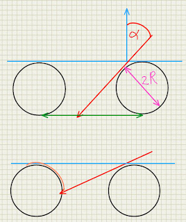
Fibers are generally not square. Their cross section more often approximates a circle. This does affect the occlusion a little bit because unlike a square the apparent cross section does not change with the angle of incidence. This means that we can approximate the transmission factor the apparent surface minus the diameter of the fiber as shown in the diagram below:

If the angle of incidence α is so large that cos(α) < 2r there will be no transmission at all.
So far this doesn't differ that much from a square cross section, however there is another phenomenon that we want to model: the sharpness of the specular reflection changes with the angle of incidence.
This happens once the angle of incidence is so large that the fiber start to occlude each other. As the occlusion increases, we see effectively a smaller segment of a circle (orange arc in left circlebin lower part of the diagram) and therefore we see less different normals. As we approach a grazing angle we effectively see just the top of the circle with normals nearly identical to the surface normal. It can be shown that the size of the circle segment we see is proportional to the angle of incidence as well.
If we compare the old and the new shader the result looks quite different:

The old equation

With new equation

Code and example node setup

The code is rather self explanatory:
shader sheet_occlusion2 (
  normal Normal=N,
  float Radius=0.05,

  output float Fac=1,
  output float Var=1
){
  // calculate angle of incidence
  float alpha = acos(dot(I,Normal));
  // treat front and back the same
  alpha = alpha > M_PI_2 ? M_PI - alpha : alpha;
  // calculate the non occluded fraction 
  Fac = cos(alpha) - 2 * Radius;
  // calculate the range of the visible normals
  if( Fac < 0 ){
    Fac = 0;
    Var = cos(alpha) / (2 * Radius);
  }
}
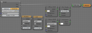
And the sample node setup mixes transparent shader with a non transparent shader just like before but uses the Var output to modify the shininess of the non transparent shader:

Code availability

The shader is available on GitHub. If you would like to know more about programming OSL you might be interested in my book "Open Shading Language for Blender". More on the availability of this book and a sample can be found on this page.
OSL Lace curtain shader for Blender Cycles

Lace curtains and sheer nylon stockings are partially transparent but not the way frosted glass is. Frosted glass transmits light but also diffuses it, making it almost impossible to see anything through it. Lace curtains on the other hand only obscure what's behind them if the threads of the fabric block the line of sight.

This results in the effect that you can see through lace curtains quite well if they are more or less straight and you are viewing them head on but that it is impossible to see anything behind them if seen from a glancing angle. The effect is visible quite well on the part of the curtain in front of the blue cube. Even though there isn't much specular light on the rightmost fold in front of the blue cube, it still looks brighter.

Calculating occlusion

This behavior is reminiscent of fresnel reflection but the formula is a bit different. In the diagram below the threads of the fabric are approximated by black squares. In the gap between these squares a portion is obscured from view depending on the angle α between the surface normal N and the incident ray I. The ratio between the occluded portion (pink) and the side of the square is tan(α). From the diagram it can be seen that at a certain point α is so large that the occluded portion is bigger than the gap is wide, rendering the surface effectively opaque.

Code sample and node setup

The code implementing this setup is very short and straightforward:
shader sheet_occlusion (
  normal Normal=N,
  float Radius=0.05,

  output float Fac=1
){
  // calculate angle of incidence
  float alpha = acos(dot(I,Normal));
  // treat front and back the same
  alpha = alpha > M_PI_2 ? M_PI - alpha : alpha;
  //printf("%.2f %.2f\n",alpha,tan(alpha));
  // calculate the non occluded fraction 
  Fac = 1 - Radius - Radius * tan(alpha);
}
The Fac output can be used to mix a fabric shader and a transparent shader as shown in the node setup below:

To get a pattern you could plug a black and white texture of real lace into the Radius socket.

Code availability

The shader is available on GitHub. If you would like to know more about programming OSL you might be interested in my book "Open Shading Language for Blender". More on the availability of this book and a sample can be found on this page.
Gears 2.0 (work in progres), part V, a Blender add-on

I am happy to announce that version 0.0.5 of the Gears 2.0 script is now available on GitGub. Its main new feature is the option the create involute gears, the most widely used tooth shape in modern gearing designs.

The accuracy of the involute curve can be controlled with the steps parameter and extra space below the dedendum can be created with the fillet parameter. Likewise, extra backlash can be created between the teeth with the backlash parameter. I haven't yet printed any gears so I can't vouch for their actual mechanical behavior but for now I think this is a good start (although the shape of the fillet/undercut could be better I guess). [edit: v0.0.6 now has a shift parameter which for positive values gives a taller addendum and a shallower dedendum and for negative values the opposite. This is useful to tweak the load a gear can bear. Obviously these values should best match on adjacent gears but that is not yet done automatically]

Although I do not approximate the involute curve of the tooth with splines, this article was invaluable in getting the equations correct without trying to find it out all by myself. An example set of parameter settings is shown at the end.

Gears 2.0, a work in progress

The script is discussed on this thread on Blenderartists, feel free to comment there. It also has its own entry in Blenders upload tracker.
The code is available from GitHub, install it in the usual way from

File->User preferences->Addons->Install from file and don't forget to check the checkbox to actually activate it.

As the example below shows for a 44 teeth gear of radius 1, the fillet/undercut needs some work (it's too wide/deep) but the shape of the involute tooth itself seems ok. The read circle is the pitch radius, the blue circle the base radius (that is pitch radius * cosine( pressure angle )).

The settings to produce the gear shown above were:

3D Printing Blueprints Full Review

3D Printing Blueprints by Joe Larson, Packt Publishing
(click to go to the publisher's website)

Impressions

With literally dozens of books on 3d printing on the market yet another one has to be something of quality to be able to compete and indeed 3D Printing Blueprints does offer quality.

It has many pros:

  • clear writing style
  • good illustrations, in color, illustrating each step
  • good coverage of concepts; modelling, material constraints, copying real life objects, designing reusable components, creating multiple component designs

Of course there are some cons:

  • it's a bit short, more examples would help getting key concepts across even better
  • focus is almost exclusively on makerbot and plastics (I.e home printing) while outsourcing the printing itself to an external printshop which might do materials like glass or metal is glossed over
  • sometimes the illustrations are too wide for the format (I read the epub version with Aldiko on a 10" tablet so that shouldn't have occured)

What I didn't get entirely is why Blender was chosen as a modelling program. Yes it is great at modelling but many really useful features for 3d printing where not used, like assigning units (metric or imperial) or using the solidify operator, And while the introduction to basic modeling was adequate, if you keep to simple modelling a program with a gentler learning curve than Blender like for example Wings3d might have been a better choice. Of course the newest Blender revisions have addons specifically designed to help in getting your model ready for 3D printing but these are not covered in the book.

On the other hand the chapter on designing a posable teddy bear is very in depth indeed and does make use of the fairly new skin operator and some of the dynamic topology features in sculpting. It is a good introduction to skinning a stick figure and sculpting the result (and the result is cute :-).

Conlusion

So in the end, not a bad book at all if you want to give 3d printing a go and want to do more than just download and print stuff other people have designed.

Packt publishing asked me to read 3D Printing Blueprints and to write a review about it. First impressions are promising and I hope to complete reading it soon.

The software used is mainly Blender (otherwise I wouldn't discuss it here) and although the projects are focussed on printing at home on a Makerbot printer, a quick scan seems to indicate the principles will apply just as well to producing stuff at an online 3D print outfit like Shapeways.

Anyway, watch these pages for a full review somewhere next week or so.